Bootstrap 框架为图片提供了一些预设的样式类,以帮助开发者轻松地对图片排版。本教程展示了如何让图片支持响应式行为(这样它们就不会超出父元素的范围)以及如何通过类(class)添加些许样式。
一、响应式图片
通过 Bootstrap 所提供的 .img-fluid 类让图片支持响应式布局。其原理是将 max-width: 100%; 和 height: auto; 赋予图片,以便随父元素一起缩放。
<img src="..." class="img-fluid" alt="...">

二、SVG图片和IE浏览器
在 Internet Explorer 10 和 11 中,添加 .img-fluid 类的 SVG 图片的尺寸比例是错误的。要解决此问题,请在必要时添加 width: 100%; 或 .w-100。此修复方法无法正确调整其它图片格式的尺寸,因此 Bootstrap 不会自动开启此方法。
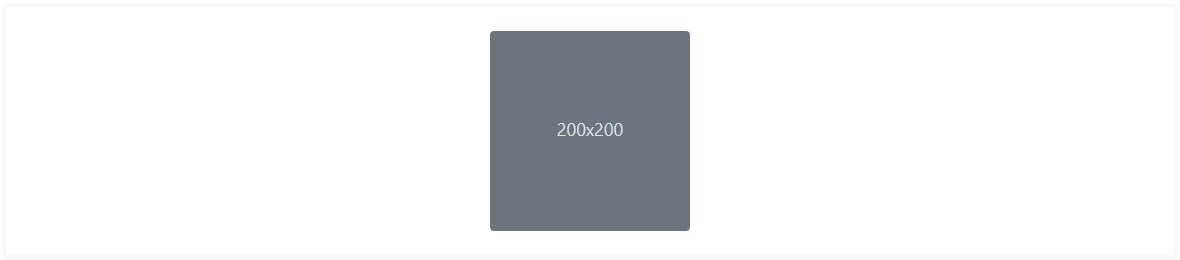
三、图片缩略图
除了 Bootstrap 提供的 border-radius utilities 外,还可以使用 .img-thumbnail 使图片的外观具有 1px 宽度的圆形边框。
<img src="..." class="img-thumbnail" alt="...">

四、对齐图片
通过使用 helper float classes 或 text alignment classes 将图片对齐。块级(block-level)图片可以使用 the .mx-auto margin utility class 居中对齐。
<img src="..." class="rounded float-left" alt="...">
<img src="..." class="rounded float-right" alt="...">

<img src="..." class="rounded mx-auto d-block" alt="...">
<div class="text-center">
<img src="..." class="rounded" alt="...">
</div>

五、<picture>
如果使用 <picture> 元素为某个 <img> 指定多个 <source> 元素的话,请确保将 .img-* 类添加到 <img> 元素而不是 <picture> 元素上。
<picture>
<source srcset="..." type="image/svg+xml">
<img src="..." class="img-fluid img-thumbnail" alt="...">
</picture>