
Bootstrap支持创建自定义表单,如复选框、单选按钮、文件输入等。Bootstrap提供了一套强大的工具,用于自定义和扩展表单的样式和布局。这些工具包括各种预定义的类,可以用来修改表单控件的外观,以实现与浏览器和设备之间更一致的展示。
一、复选框和单选按钮
每个复选框、单选按钮和配对都包装在一个 div 中以创建Bootstrap的自定义控件。从结构上讲,这与默认方法相同。
Bootstrap将同级选择器用于所有状态(例如:checked)来正确设置自定义表单指示器的样式。当与类结合使用时,我们还可以根据输入框的状态为每个项目设置文本样式。
Bootstrap隐藏默认值并使用伪元素和内容属性来构建一个新的自定义表单指示器。不幸的是,Bootstrap不能仅从 CSS 在该元素上不起作用。
在选中状态下,Bootstrap使用 Open Iconic 的 base64 嵌入式 SVG 图标。这为Bootstrap提供了跨浏览器和设备进行样式和定位的最佳控制。
1、复选框

<div class="custom-control custom-checkbox">
<input type="checkbox" class="custom-control-input" id="customCheck1">
<label class="custom-control-label" for="customCheck1">Check this custom checkbox</label>
</div>
当通过 JavaScript 手动设置时,自定义复选框也可以利用伪类:indeterminate(没有可用的 HTML 属性来指定它)。

如果使用的是jQuery,像这样的东西就足够了:
$('.your-checkbox').prop('indeterminate', true)
2、单选按钮

<div class="custom-control custom-radio">
<input type="radio" id="customRadio1" name="customRadio" class="custom-control-input">
<label class="custom-control-label" for="customRadio1">Toggle this custom radio</label>
</div>
<div class="custom-control custom-radio">
<input type="radio" id="customRadio2" name="customRadio" class="custom-control-input">
<label class="custom-control-label" for="customRadio2">Or toggle this other custom radio</label>
</div>
二、内嵌

<div class="custom-control custom-radio custom-control-inline">
<input type="radio" id="customRadioInline1" name="customRadioInline" class="custom-control-input">
<label class="custom-control-label" for="customRadioInline1">Toggle this custom radio</label>
</div>
<div class="custom-control custom-radio custom-control-inline">
<input type="radio" id="customRadioInline2" name="customRadioInline" class="custom-control-input">
<label class="custom-control-label" for="customRadioInline2">Or toggle this other custom radio</label>
</div>
三、禁用
disabled也可以禁用自定义复选框和单选按钮。将 boolean 属性添加到<input>中,自定义指示器和标签描述将自动设置样式。

<div class="custom-control custom-checkbox">
<input type="checkbox" class="custom-control-input" id="customCheckDisabled1" disabled>
<label class="custom-control-label" for="customCheckDisabled1">Check this custom checkbox</label>
</div>
<div class="custom-control custom-radio">
<input type="radio" name="radioDisabled" id="customRadioDisabled2" class="custom-control-input" disabled>
<label class="custom-control-label" for="customRadioDisabled2">Toggle this custom radio</label>
</div>
四、开关
开关具有自定义复选框的标记,但使用.custom-switchdisabled类来呈现切换开关。开关也支持该属性。

<div class="custom-control custom-switch">
<input type="checkbox" class="custom-control-input" id="customSwitch1">
<label class="custom-control-label" for="customSwitch1">Toggle this switch element</label>
</div>
<div class="custom-control custom-switch">
<input type="checkbox" class="custom-control-input" disabled id="customSwitch2">
<label class="custom-control-label" for="customSwitch2">Disabled switch element</label>
</div>
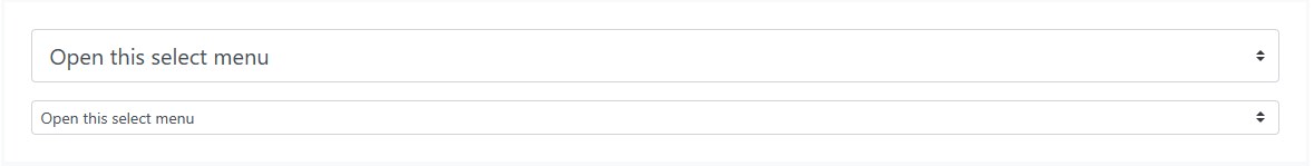
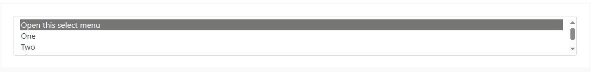
五、选择菜单
自定义菜单只需要一个自定义类即可触发自定义样式。自定义样式仅限于<select>的初始外观,并且由于浏览器限制而无法修改.custom-select<select><option>。

<select class="custom-select">
<option selected>Open this select menu</option>
<option value="1">One</option>
<option value="2">Two</option>
<option value="3">Three</option>
</select>
还可以从小型和大型自定义选择中进行选择,以匹配我们类似大小的文本输入。
<select class="custom-select custom-select-lg mb-3">
<option selected>Open this select menu</option>
<option value="1">One</option>
<option value="2">Two</option>
<option value="3">Three</option>
</select>
<select class="custom-select custom-select-sm">
<option selected>Open this select menu</option>
<option value="1">One</option>
<option value="2">Two</option>
<option value="3">Three</option>
</select>
Bootstrap还支持multiple属性。

<select class="custom-select" multiple>
<option selected>Open this select menu</option>
<option value="1">One</option>
<option value="2">Two</option>
<option value="3">Three</option>
</select>
size属性:
<select class="custom-select" size="3">
<option selected>Open this select menu</option>
<option value="1">One</option>
<option value="2">Two</option>
<option value="3">Three</option>
</select>
六、范围
使用<input type=”range”>创建自定义控件。轨道(背景)和拇指(值)的样式在浏览器中显示相同。由于只有 IE 和 Firefox 支持从拇指的左侧或右侧“填充”其轨道,以直观地指示进度,因此我们目前不支持.custom-range。
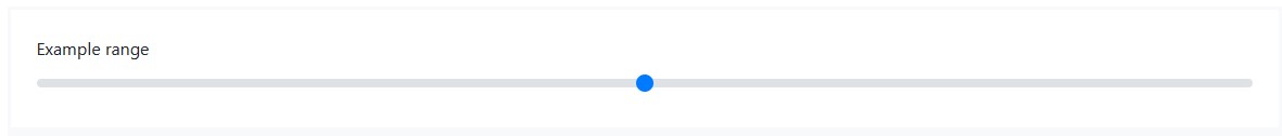
<label for="customRange1">Example range</label>
<input type="range" class="custom-range" id="customRange1">
范围输入具有 min 和 max 属性,分别表示输入值的最小值和最大值。
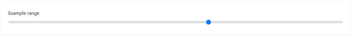
<label for="customRange2">Example range</label>
<input type="range" class="custom-range" min="0" max="5" id="customRange2">
默认情况下,范围输入“捕捉”为整数值。若要更改此设置,可以指定一个值。在下面的示例中,我们使用stepstep=”0.5″将步骤数增加一倍。

<label for="customRange3">Example range</label>
<input type="range" class="custom-range" min="0" max="5" step="0.5" id="customRange3">
七、文件浏览器
文件输入是最粗糙的,如果想将它们与功能性选择文件…和选定文件名文本连接起来,则需要额外的 JavaScript。

<div class="custom-file">
<input type="file" class="custom-file-input" id="customFile">
<label class="custom-file-label" for="customFile">Choose file</label>
</div>
1、使用 SCSS 翻译或自定义字符串
:lang()$custom-file-textes伪类用于将“浏览”文本翻译成其他语言。使用相关的语言标记和本地化字符串覆盖或添加条目到 Sass 变量。英文字符串可以以相同的方式自定义。例如,以下是添加西班牙语翻译的方法(西班牙语的语言代码是):
$custom-file-text: (
en: "Browse",
es: "Elegir"
);
以下是对西班牙语翻译的自定义文件输入的操作:lang(es)

<div class="custom-file">
<input type="file" class="custom-file-input" id="customFileLang" lang="es">
<label class="custom-file-label" for="customFileLang">Seleccionar Archivo</label>
</div>
需要正确设置文档(或其子树)的语言,以便显示正确的文本。这可以使用元素上的 lang 属性或 Content-Language HTTP 标头等方法来完成。
2、使用 HTML 翻译或自定义字符串
Bootstrap 还提供了一种在 HTML 中翻译“浏览”文本的方法,该文本带有可以添加到自定义输入标签中的属性(荷兰语示例):data-browse

<div class="custom-file">
<input type="file" class="custom-file-input" id="customFileLangHTML">
<label class="custom-file-label" for="customFileLangHTML" data-browse="Bestand kiezen">Voeg je document toe</label>
</div>