Bootstrap静态框(Modal)是一种常用的交互组件,主要用于在网页上创建对话框,常见的应用场景包括Bootstrap静态框(Modal)是一种常用的交互组件,主要用于在网页上创建对话框,常见的应用场景包括灯箱、用户通知或完全自定义的内容。
一、运作方式
在使用 Bootstrap 的模态组件之前,请务必阅读以下内容,因为 Bootstrap 的菜单选项最近发生了变化。
1、模态是通过使用 HTML、CSS 和 JavaScript 构建的。它们位于文档中的其他所有内容之上,并从中删除滚动条,以便模态内容可以滚动。
2、单击模态窗口外部的区域将自动关闭模态。
3、Bootstrap 同时仅支持一个模态窗口。不支持嵌套模态,因为我们认为它们会带来糟糕的用户体验。
4、模态使用 position: fixed,这有时对其渲染有点特殊。尽可能将模态 HTML 放在顶级位置,以避免其他元素的潜在干扰。将模态嵌套在另一个固定元素中时,可能会遇到问题。
5、由于 HTML5 定义其语义的方式,自动对焦 HTML 属性在 Bootstrap 模态中没有影响。要达到相同的效果,请使用一些自定义 JavaScript:
$('#myModal').on('shown.bs.modal', function () {
$('#myInput').trigger('focus')
})
二、模态组件
下面是一个静态模态示例。包括模态页眉、模态正文(必需)和模态页脚(可选)。我们要求尽可能在模式标头中包含关闭操作,或提供另一个显式关闭操作。
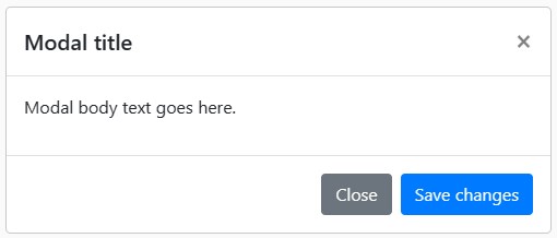
<div class="modal" tabindex="-1"> <div class="modal-dialog"> <div class="modal-content"> <div class="modal-header"> <h5 class="modal-title">Modal title</h5> <button type="button" class="close" data-dismiss="modal" aria-label="Close"> <span aria-hidden="true">×</span> </button> </div> <div class="modal-body"> <p>Modal body text goes here.</p> </div> <div class="modal-footer"> <button type="button" class="btn btn-secondary" data-dismiss="modal">Close</button> <button type="button" class="btn btn-primary">Save changes</button> </div> </div> </div> </div>
三、演示模式
通过单击下面的按钮切换工作模态演示,它将从页面顶部向下滑动并淡入。

<!-- Button trigger modal --> <button type="button" class="btn btn-primary" data-toggle="modal" data-target="#exampleModal"> Launch demo modal </button> <!-- Modal --> <div class="modal fade" id="exampleModal" tabindex="-1" aria-labelledby="exampleModalLabel" aria-hidden="true"> <div class="modal-dialog"> <div class="modal-content"> <div class="modal-header"> <h5 class="modal-title" id="exampleModalLabel">Modal title</h5> <button type="button" class="close" data-dismiss="modal" aria-label="Close"> <span aria-hidden="true">×</span> </button> </div> <div class="modal-body"> ... </div> <div class="modal-footer"> <button type="button" class="btn btn-secondary" data-dismiss="modal">Close</button> <button type="button" class="btn btn-primary">Save changes</button> </div> </div> </div> </div>
四、静态背景
当背景设置为静态时,在外部单击时,模态不会关闭。点击下面的按钮进行尝试。
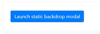
<!-- Button trigger modal --> <button type="button" class="btn btn-primary" data-toggle="modal" data-target="#staticBackdrop"> Launch static backdrop modal </button> <!-- Modal --> <div class="modal fade" id="staticBackdrop" data-backdrop="static" data-keyboard="false" tabindex="-1" aria-labelledby="staticBackdropLabel" aria-hidden="true"> <div class="modal-dialog"> <div class="modal-content"> <div class="modal-header"> <h5 class="modal-title" id="staticBackdropLabel">Modal title</h5> <button type="button" class="close" data-dismiss="modal" aria-label="Close"> <span aria-hidden="true">×</span> </button> </div> <div class="modal-body"> ... </div> <div class="modal-footer"> <button type="button" class="btn btn-secondary" data-dismiss="modal">Close</button> <button type="button" class="btn btn-primary">Understood</button> </div> </div> </div> </div>
五、滚动长内容
当模态对于用户的视口或设备来说太长时,它们会独立于页面本身滚动。
还可以创建一个可滚动的模态,该模态允许通过添加.modal-dialog-scrollable.modal-dialog来滚动模态主体。
<!-- Scrollable modal -->
<div class="modal-dialog modal-dialog-scrollable">
...
</div>
六、垂直居中
添加到.modal-dialog-centered.modal-dialog以垂直居中模式。
<!-- Vertically centered modal -->
<div class="modal-dialog modal-dialog-centered">
...
</div>
<!-- Vertically centered scrollable modal -->
<div class="modal-dialog modal-dialog-centered modal-dialog-scrollable">
...
</div>
七、工具提示和弹出框
工具提示和弹出框可以根据需要放置在模态中。当模式关闭时,其中的任何工具提示和弹出框也会自动关闭。
<div class="modal-body">
<h5>Popover in a modal</h5>
<p>This <a href="#" rel="external nofollow"  rel="external nofollow"  rel="external nofollow"  role="button" class="btn btn-secondary popover-test" title="Popover title" data-content="Popover body content is set in this attribute.">button</a> triggers a popover on click.</p>
<hr>
<h5>Tooltips in a modal</h5>
<p><a href="#" rel="external nofollow"  rel="external nofollow"  rel="external nofollow"  class="tooltip-test" title="Tooltip">This link</a> and <a href="#" rel="external nofollow"  rel="external nofollow"  rel="external nofollow"  class="tooltip-test" title="Tooltip">that link</a> have tooltips on hover.</p>
</div>
八、使用网格
通过嵌套在模态中来利用 Bootstrap 网格系统。然后,像使用其他任何地方一样使用普通的网格系统类。
<div class="modal-body">
<div class="container-fluid">
<div class="row">
<div class="col-md-4">.col-md-4</div>
<div class="col-md-4 ml-auto">.col-md-4 .ml-auto</div>
</div>
<div class="row">
<div class="col-md-3 ml-auto">.col-md-3 .ml-auto</div>
<div class="col-md-2 ml-auto">.col-md-2 .ml-auto</div>
</div>
<div class="row">
<div class="col-md-6 ml-auto">.col-md-6 .ml-auto</div>
</div>
<div class="row">
<div class="col-sm-9">
Level 1: .col-sm-9
<div class="row">
<div class="col-8 col-sm-6">
Level 2: .col-8 .col-sm-6
</div>
<div class="col-4 col-sm-6">
Level 2: .col-4 .col-sm-6
</div>
</div>
</div>
</div>
</div>
</div>
九、不同模态内容
有一堆按钮都触发相同的模态,但内容略有不同。使用 和 HTML data-* 属性(可能通过 jQuery)根据单击的按钮来改变模式的内容。
下面是一个现场演示,然后是示例 HTML 和 JavaScript。
<button type="button" class="btn btn-primary" data-toggle="modal" data-target="#exampleModal" data-whatever="@mdo">Open modal for @mdo</button> <button type="button" class="btn btn-primary" data-toggle="modal" data-target="#exampleModal" data-whatever="@fat">Open modal for @fat</button> <button type="button" class="btn btn-primary" data-toggle="modal" data-target="#exampleModal" data-whatever="@getbootstrap">Open modal for @getbootstrap</button> <div class="modal fade" id="exampleModal" tabindex="-1" aria-labelledby="exampleModalLabel" aria-hidden="true"> <div class="modal-dialog"> <div class="modal-content"> <div class="modal-header"> <h5 class="modal-title" id="exampleModalLabel">New message</h5> <button type="button" class="close" data-dismiss="modal" aria-label="Close"> <span aria-hidden="true">×</span> </button> </div> <div class="modal-body"> <form> <div class="form-group"> <label for="recipient-name" class="col-form-label">Recipient:</label> <input type="text" class="form-control" id="recipient-name"> </div> <div class="form-group"> <label for="message-text" class="col-form-label">Message:</label> <textarea class="form-control" id="message-text"></textarea> </div> </form> </div> <div class="modal-footer"> <button type="button" class="btn btn-secondary" data-dismiss="modal">Close</button> <button type="button" class="btn btn-primary">Send message</button> </div> </div> </div> </div>
$('#exampleModal').on('show.bs.modal', function (event) {
var button = $(event.relatedTarget) // Button that triggered the modal
var recipient = button.data('whatever') // Extract info from data-* attributes
// If necessary, you could initiate an AJAX request here (and then do the updating in a callback).
// Update the modal's content. We'll use jQuery here, but you could use a data binding library or other methods instead.
var modal = $(this)
modal.find('.modal-title').text('New message to ' + recipient)
modal.find('.modal-body input').val(recipient)
})
十、更改动画
该变量确定模态淡入动画之前的变换状态,该变量确定模态淡入动画结束时的变换。例如,如果需要放大动画,可以设置 .$modal-fade-transform: scale(.8)
十一、删除动画
对于仅显示而不是淡入视图的模态,请从模态标记中删除该类
<div class="modal" tabindex="-1" aria-labelledby="..." aria-hidden="true">
...
</div>
十二、动态高度
如果模态在打开时高度发生变化,则应调用以重新调整模态的位置,以防出现滚动条。
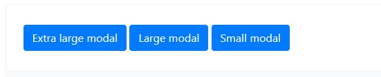
十三、可选尺寸
模态有三种可选大小,可通过放置在.modal-dialog这些大小在某些断点处启动,以避免在较窄的视口上出现水平滚动条。
| Size | Class | Modal max-width |
| Small | .modal-sm | 300px |
| Default | None | 500px |
| Large | .modal-lg | 800px |
| Extra large | .modal-xl | 1140px |
没有修饰符类的默认模态构成了“中等”大小的模态。
<div class="modal-dialog modal-xl">...</div>
<div class="modal-dialog modal-lg">...</div>
<div class="modal-dialog modal-sm">...</div>
十四、用法
模态插件通过数据属性或 JavaScript 按需切换隐藏内容。它还增加了 to 覆盖默认滚动行为,并生成一个 to 提供一个单击区域,用于在单击模式外部时关闭显示的模式。
1、通过数据属性
在不编写 JavaScript 的情况下激活模式。在控制器元素(如按钮)上设置,以及 or 以目标特定模式进行切换。
<button type="button" data-toggle="modal" data-target="#myModal">Launch modal</button>
2、通过JavaScript
使用一行 JavaScript 调用具有 id 的模态:
$('#myModal').modal(options)
3、选项
选项可以通过数据属性或 JavaScript 传递。对于数据属性,将选项名称追加到data-data-backdrop=””,如下表中所示。
| Name | Type | Default | Description |
| backdrop | boolean or the string ‘static’ | TRUE | Includes a modal-backdrop element. Alternatively, specify for a backdrop which doesn’t close the modal on click.static |
| keyboard | boolean | TRUE | Closes the modal when escape key is pressed |
| focus | boolean | TRUE | Puts the focus on the modal when initialized. |
| show | boolean | TRUE | Shows the modal when initialized. |
4、方法
异步方法和转换:所有 API 方法都是异步的,并启动转换。它们在转换开始后但在转换结束之前立即返回给调用方。此外,对转换组件的方法调用将被忽略。
.modal(options):将内容激活为模态。接受可选选项 。
$('#myModal').modal({
keyboard: false
})
.modal(‘toggle’):手动切换模式。在模态实际显示或隐藏之前(即在 or 事件发生之前)返回给调用方。
$('#myModal').modal('toggle')
.modal(‘show’):手动打开模式。在实际显示模态之前(即在事件发生之前)返回给调用方。
$('#myModal').modal('show')
.modal(‘hide’):手动隐藏模式。在模态实际隐藏之前(即在事件发生之前)返回给调用方。
$('#myModal').modal('hide')
.modal(‘handleUpdate’):如果模态在打开时模式的高度发生变化(即出现滚动条),则手动重新调整模式的位置。
$('#myModal').modal('handleUpdate')
.modal(‘dispose’):销毁元素的模态。
十五、事件
Bootstrap 的模态类公开了一些事件,用于挂接到模态功能。所有模态事件都是在模态本身触发的。
| Event Type | Description |
| show.bs.modal | This event fires immediately when the instance method is called. If caused by a click, the clicked element is available as the property of the event.showrelatedTarget |
| shown.bs.modal | This event is fired when the modal has been made visible to the user (will wait for CSS transitions to complete). If caused by a click, the clicked element is available as the property of the event.relatedTarget |
| hide.bs.modal | This event is fired immediately when the instance method has been called.hide |
| hidden.bs.modal | This event is fired when the modal has finished being hidden from the user (will wait for CSS transitions to complete). |
| hidePrevented.bs.modal | This event is fired when the modal is shown, its backdrop is and a click outside the modal or an escape key press is performed with the keyboard option or set to .staticdata-keyboardfalse |
$('#myModal').on('hidden.bs.modal', function (event) {
// do something...
})