
在进行Web开发时,经常需要对页面中的元素进行尺寸调整,以适配不同的屏幕大小和显示设备。Bootstrap提供了一组通用类别,例如宽度和高度类别,可以帮助开发者轻松地改变元素的宽度和高度,还可以根据屏幕大小自动调整元素的尺寸,从而实现响应式布局。
一、相对于父元素
宽度和高度通用类别从_utilities.scss中产生。预设包含25%,50%,75%,100%和auto。按你的需求调整这些值,可产生不同的属性。
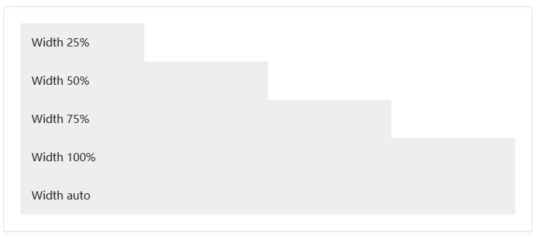
<div class="w-25 p-3" style="background-color: #eee;">Width 25%</div>
<div class="w-50 p-3" style="background-color: #eee;">Width 50%</div>
<div class="w-75 p-3" style="background-color: #eee;">Width 75%</div>
<div class="w-100 p-3" style="background-color: #eee;">Width 100%</div>
<div class="w-auto p-3" style="background-color: #eee;">Width auto</div>
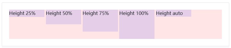
<div style="height: 100px; background-color: rgba(255,0,0,0.1);">
<div class="h-25 d-inline-block" style="width: 120px; background-color: rgba(0,0,255,.1)">Height 25%</div>
<div class="h-50 d-inline-block" style="width: 120px; background-color: rgba(0,0,255,.1)">Height 50%</div>
<div class="h-75 d-inline-block" style="width: 120px; background-color: rgba(0,0,255,.1)">Height 75%</div>
<div class="h-100 d-inline-block" style="width: 120px; background-color: rgba(0,0,255,.1)">Height 100%</div>
<div class="h-auto d-inline-block" style="width: 120px; background-color: rgba(0,0,255,.1)">Height auto</div>
</div>
还可以根据需求使用max-width: 100%;和max-height: 100%;通用类别。
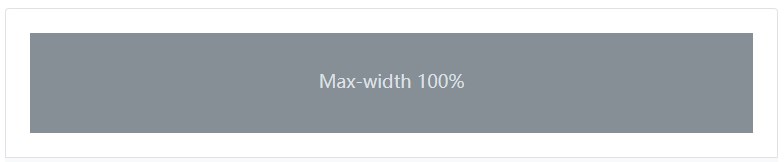
<img src="..." class="mw-100" alt="...">
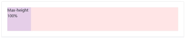
<div style="height: 100px; background-color: rgba(255,0,0,.1);">
<div class="mh-100" style="width: 100px; height: 200px; background-color: rgba(0,0,255,.1);">Max-height 100%</div>
</div>
二、相对于视窗
还可以使用通用类别来设定相对于视窗的宽度和高度。
<div class="min-vw-100">Min-width 100vw</div>
<div class="min-vh-100">Min-height 100vh</div>
<div class="vw-100">Width 100vw</div>
<div class="vh-100">Height 100vh</div>
三、Sass
尺寸工具类可以在我们的SCSS文件中的utilities API(实用工具接口)中找到。
"width": (
property: width,
class: w,
values: (
25: 25%,
50: 50%,
75: 75%,
100: 100%,
auto: auto
)
),
"max-width": (
property: max-width,
class: mw,
values: (100: 100%)
),
"viewport-width": (
property: width,
class: vw,
values: (100: 100vw)
),
"min-viewport-width": (
property: min-width,
class: min-vw,
values: (100: 100vw)
),
"height": (
property: height,
class: h,
values: (
25: 25%,
50: 50%,
75: 75%,
100: 100%,
auto: auto
)
),
"max-height": (
property: max-height,
class: mh,
values: (100: 100%)
),
"viewport-height": (
property: height,
class: vh,
values: (100: 100vh)
),
"min-viewport-height": (
property: min-height,
class: min-vh,
values: (100: 100vh)
),