Bootstrap 提供了警告框(alert)功能,通过精炼且灵活的警告消息为典型的用户操作提供契合上下文的反馈。
一、警告框
警报可用于任何长度的文本,以及可选的关闭按钮。要获得正确的样式,请使用八个必需的上下文类之一(例如,.alert-success)。对于内联移除,请使用alerts JavaScript插件。
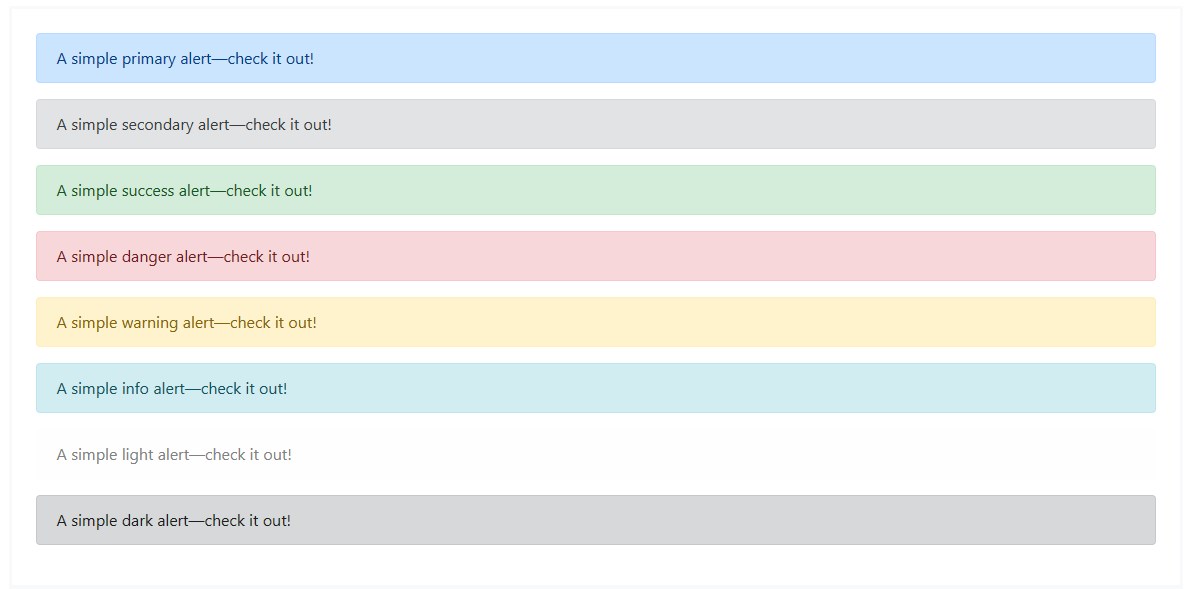
<div class="alert alert-primary" role="alert">
A simple primary alert—check it out!
</div>
<div class="alert alert-secondary" role="alert">
A simple secondary alert—check it out!
</div>
<div class="alert alert-success" role="alert">
A simple success alert—check it out!
</div>
<div class="alert alert-danger" role="alert">
A simple danger alert—check it out!
</div>
<div class="alert alert-warning" role="alert">
A simple warning alert—check it out!
</div>
<div class="alert alert-info" role="alert">
A simple info alert—check it out!
</div>
<div class="alert alert-light" role="alert">
A simple light alert—check it out!
</div>
<div class="alert alert-dark" role="alert">
A simple dark alert—check it out!
</div>
向辅助技术传达意义:使用颜色来增加意义只会提供一种视觉指示,而不会传达给辅助技术(如屏幕阅读器)的用户。确保由颜色表示的信息在内容本身(例如可见文本)中是明显的,或者通过其他方式包含,例如使用 .visually-hidden类隐藏的其他文本。
二、链接颜色
使用 .alert-link 实用程序类可以在任何警报中快速提供匹配的彩色链接。

<div class="alert alert-primary" role="alert">
A simple primary alert with <a href="#" rel="external nofollow"  rel="external nofollow"  rel="external nofollow"  rel="external nofollow"  rel="external nofollow"  rel="external nofollow"  rel="external nofollow"  rel="external nofollow"  class="alert-link">an example link</a>. Give it a click if you like.
</div>
<div class="alert alert-secondary" role="alert">
A simple secondary alert with <a href="#" rel="external nofollow"  rel="external nofollow"  rel="external nofollow"  rel="external nofollow"  rel="external nofollow"  rel="external nofollow"  rel="external nofollow"  rel="external nofollow"  class="alert-link">an example link</a>. Give it a click if you like.
</div>
<div class="alert alert-success" role="alert">
A simple success alert with <a href="#" rel="external nofollow"  rel="external nofollow"  rel="external nofollow"  rel="external nofollow"  rel="external nofollow"  rel="external nofollow"  rel="external nofollow"  rel="external nofollow"  class="alert-link">an example link</a>. Give it a click if you like.
</div>
<div class="alert alert-danger" role="alert">
A simple danger alert with <a href="#" rel="external nofollow"  rel="external nofollow"  rel="external nofollow"  rel="external nofollow"  rel="external nofollow"  rel="external nofollow"  rel="external nofollow"  rel="external nofollow"  class="alert-link">an example link</a>. Give it a click if you like.
</div>
<div class="alert alert-warning" role="alert">
A simple warning alert with <a href="#" rel="external nofollow"  rel="external nofollow"  rel="external nofollow"  rel="external nofollow"  rel="external nofollow"  rel="external nofollow"  rel="external nofollow"  rel="external nofollow"  class="alert-link">an example link</a>. Give it a click if you like.
</div>
<div class="alert alert-info" role="alert">
A simple info alert with <a href="#" rel="external nofollow"  rel="external nofollow"  rel="external nofollow"  rel="external nofollow"  rel="external nofollow"  rel="external nofollow"  rel="external nofollow"  rel="external nofollow"  class="alert-link">an example link</a>. Give it a click if you like.
</div>
<div class="alert alert-light" role="alert">
A simple light alert with <a href="#" rel="external nofollow"  rel="external nofollow"  rel="external nofollow"  rel="external nofollow"  rel="external nofollow"  rel="external nofollow"  rel="external nofollow"  rel="external nofollow"  class="alert-link">an example link</a>. Give it a click if you like.
</div>
<div class="alert alert-dark" role="alert">
A simple dark alert with <a href="#" rel="external nofollow"  rel="external nofollow"  rel="external nofollow"  rel="external nofollow"  rel="external nofollow"  rel="external nofollow"  rel="external nofollow"  rel="external nofollow"  class="alert-link">an example link</a>. Give it a click if you like.
</div>
三、附加内容
警告框(alert)还可以包含其他HTML元素,如标题、段落和分隔符。
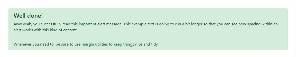
<div class="alert alert-success" role="alert">
<h4 class="alert-heading">Well done!</h4>
<p>Aww yeah, you successfully read this important alert message. This example text is going to run a bit longer so that you can see how spacing within an alert works with this kind of content.</p>
<hr>
<p class="mb-0">Whenever you need to, be sure to use margin utilities to keep things nice and tidy.</p>
</div>
四、关闭警告框
使用alert JavaScript插件,可以关闭任何内联警报。方法如下:
1、确保已加载警报插件或已编译的引导JavaScript;
2、添加一个关闭按钮和.alert-dismissible类,该类在警报的右侧添加额外的填充,并定位关闭按钮;
3、在close按钮上,添加code>data-bs-dismiss=”alert”属性,该属性触发JavaScript功能。一定要使用button元素在所有设备上进行正确的操作;
4、要在解除警报时设置警报动画,请确保添加.fade和.show类。
以下是演示效果:

<div class="alert alert-warning alert-dismissible fade show" role="alert"> <strong>Holy guacamole!</strong> You should check in on some of those fields below. <button type="button" class="close" data-dismiss="alert" aria-label="Close"> <span aria-hidden="true">×</span> </button> </div>
五、通过JavaScript触发行为
1、触发器
通过 JavaScript 代码关闭警告框(alert):
$('.alert').alert()
或者在警告框(alert)组件内添加一个按钮,并为按钮设置相应的 data 属性,如下所示:
<button type="button" class="close" data-dismiss="alert" aria-label="Close"> <span aria-hidden="true">×</span> </button>
注意:关闭的警告框(alert)将被从 DOM 中删除。
2、本组件所暴露的方法
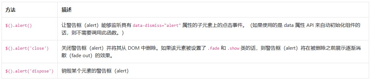
$('.alert').alert('close')
3、本组件所暴露的事件
Bootstrap 的警告框(alert)插件暴露了一些可以监听的事件。

$('#myAlert').on('closed.bs.alert', function () {
// do something...
})