Bootstrap文本是一套用于快速构建响应式网站的CSS框架,它提供了丰富的工具类来控制文本内容的对齐、折行、溢出、中断、转换、粗细、斜体、颜色和装饰等属性。轻松地实现各种文本样式效果,从而提升网站的整体视觉效果和用户体验。
一、文本对齐
使用文本对齐类可以轻松地将文本重新对齐到组件。

<p class="text-justify">Some placeholder text to demonstrate justified text alignment. Will you do the same for me? It's time to face the music I'm no longer your muse. Heard it's beautiful, be the judge and my girls gonna take a vote. I can feel a phoenix inside of me. Heaven is jealous of our love, angels are crying from up above. Yeah, you take me to utopia.</p>
对于左对齐、右对齐和居中对齐,我们还提供了响应式工具类,这些工具类使用了与栅格系统相同的基于视口(viewport)宽度的断点。
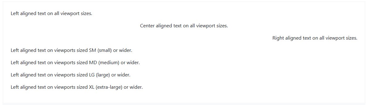
<p class="text-left">Left aligned text on all viewport sizes.</p>
<p class="text-center">Center aligned text on all viewport sizes.</p>
<p class="text-right">Right aligned text on all viewport sizes.</p>
<p class="text-sm-left">Left aligned text on viewports sized SM (small) or wider.</p>
<p class="text-md-left">Left aligned text on viewports sized MD (medium) or wider.</p>
<p class="text-lg-left">Left aligned text on viewports sized LG (large) or wider.</p>
<p class="text-xl-left">Left aligned text on viewports sized XL (extra-large) or wider.</p>
二、文字折行和溢出
利用 .text-wrap 类可以让文字折行。

<div class="badge badge-primary text-wrap" style="width: 6rem;">
This text should wrap.
</div>
使用 .text-nowrap 类可以防止文字折行。

<div class="text-nowrap bd-highlight" style="width: 8rem;">
This text should overflow the parent.
</div>
对于较长的内容,你可以通过添加 .text-truncate 类将文本截断并添加省略号。 但必须是 display: inline-block 或 display: block 类型。
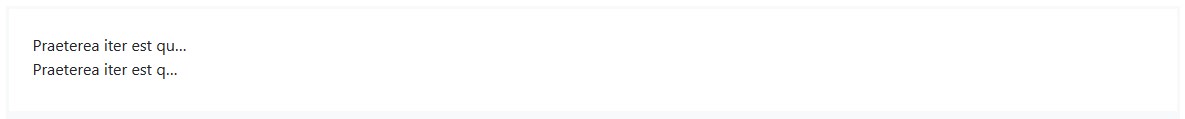
<!-- Block level -->
<div class="row">
<div class="col-2 text-truncate">
Praeterea iter est quasdam res quas ex communi.
</div>
</div>
<!-- Inline level -->
<span class="d-inline-block text-truncate" style="max-width: 150px;">
Praeterea iter est quasdam res quas ex communi.
</span>
三、单词中断
为了防止长字符串的文本破坏组件的布局,可以使用 .text-break 来设置 word-wrap: break-word 和 word-break: break-word。我们使用 word-wrap 而不是更常见的 overflow-wrap,以获得更广泛的浏览器支持,并添加已弃用的 word-break: break-word,以避免与弹性容器相关的问题。

<p class="text-break">mmmmmmmmmmmmmmmmmmmmmmmmmmmmmmmmmmmmmmmmmmmmmmmmmmmmmmmmmmmmmmmmmmmmmmmmmmmmmmmmmmmmmmmmmmmmmmmmmmmm</p>
四、文本转换
使用文本大小写类转换组件中的文本。
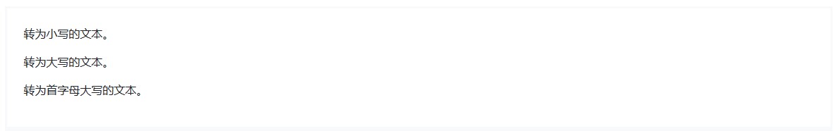
<p class="text-lowercase">转为小写的文本。</p>
<p class="text-uppercase">转为大写的文本。</p>
<p class="text-capitalize">转为首字母大写的文本。</p>
注意,.text-capitalize 只改变每个单词的第一个字母,不影响任何其他字母的大小写。
五、字体粗细和斜体
快速更改普通文本或斜体文本的字重(或粗细)。
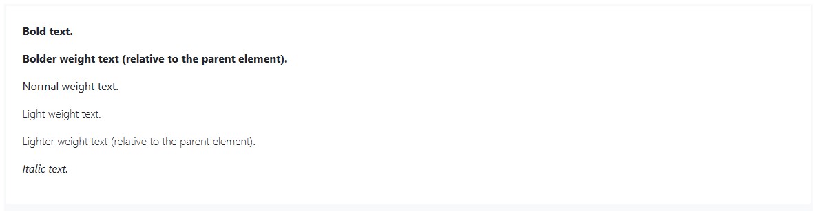
<p class="font-weight-bold">Bold text.</p>
<p class="font-weight-bolder">Bolder weight text (relative to the parent element).</p>
<p class="font-weight-normal">Normal weight text.</p>
<p class="font-weight-light">Light weight text.</p>
<p class="font-weight-lighter">Lighter weight text (relative to the parent element).</p>
<p class="font-italic">Italic text.</p>
六、等宽字体
用 .text-monospace 类将所选内容更改为等宽字体(monospace font)。

<p class="text-monospace">This is in monospace</p>
七、重置颜色
用 .text-reset 类重置文本或链接的颜色,以便从父元素继承颜色属性。

<p class="text-muted">
Muted text with a <a href="#" rel="external nofollow"  rel="external nofollow"  class="text-reset">重置链接的颜色</a>.
</p>
八、文字装饰

<a href="#" rel="external nofollow" rel="external nofollow" class="text-decoration-none">不带下划线的链接</a>