Bootstrap的吐司(Toasts)是一种轻量级通知组件,旨在模仿移动和桌面操作系统中常见的推送通知。它们使用flexbox布局构建,因此很容易进行对齐和定位。吐司组件可以在页面的任何位置显示,并且可以包含文本、图像和按钮等内容。
你可以使用Bootstrap的类来自定义吐司的样式和行为,例如更改背景颜色、文字颜色、动画效果等。通过使用Bootstrap的吐司组件,你可以轻松地向用户提供简洁而美观的通知信息。
一、toast插件
使用toast插件时需要注意的事项:
- 出于性能原因吐司是选择性加入的,所以必须自己将它们初始化;
- 如果你没有指定autohide: false,吐司会自动隐藏。
二、基础
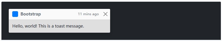
为了支持可扩充性和可预测性的吐司,我们建议加入标题和正文。基于我们的margin和flexbox通用类别,吐司的标题使用display:flex 轻松就能对齐内容。
吐司元件可灵活的配合需要,并且只需要很少的标记。我们至少需要一个单独的元素来包装“套用吐司样式”的内容,并强烈建议加上关闭按钮。

<div class="toast" role="alert" aria-live="assertive" aria-atomic="true">
<div class="toast-header">
<img src="..." class="rounded me-2" alt="...">
<strong class="me-auto">Bootstrap</strong>
<small>11 mins ago</small>
<button type="button" class="btn-close" data-bs-dismiss="toast" aria-label="Close"></button>
</div>
<div class="toast-body">
Hello, world! This is a toast message.
</div>
</div>
三、实例
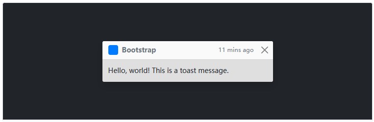
单击下面的按钮显示为toast(在右下角使用我们的实用程序定位),默认情况下已使用.hide隐藏。
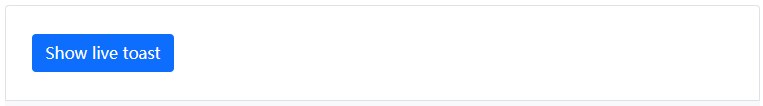
<button type="button" class="btn btn-primary" id="liveToastBtn">Show live toast</button>
<div class="position-fixed bottom-0 end-0 p-3" style="z-index: 5">
<div id="liveToast" class="toast hide" role="alert" aria-live="assertive" aria-atomic="true">
<div class="toast-header">
<img src="..." class="rounded me-2" alt="...">
<strong class="me-auto">Bootstrap</strong>
<small>11 mins ago</small>
<button type="button" class="btn-close" data-bs-dismiss="toast" aria-label="Close"></button>
</div>
<div class="toast-body">
Hello, world! This is a toast message.
</div>
</div>
</div>
四、半透明
吐司也可以是半透明的,因此能混合在它们可能出现的任何东西上。在支持CSS属性backdrop-filter的浏览器,我们还会尝试对吐司下方的元素进行模糊效果。
<div class="toast" role="alert" aria-live="assertive" aria-atomic="true">
<div class="toast-header">
<img src="..." class="rounded me-2" alt="...">
<strong class="me-auto">Bootstrap</strong>
<small class="text-muted">11 mins ago</small>
<button type="button" class="btn-close" data-bs-dismiss="toast" aria-label="Close"></button>
</div>
<div class="toast-body">
Hello, world! This is a toast message.
</div>
</div>
五、堆叠
可以透过将吐司包装于toast container来推叠它们,这将会在垂直方向上增加一些间距。

<div class="toast-container">
<div class="toast" role="alert" aria-live="assertive" aria-atomic="true">
<div class="toast-header">
<img src="..." class="rounded me-2" alt="...">
<strong class="me-auto">Bootstrap</strong>
<small class="text-muted">just now</small>
<button type="button" class="btn-close" data-bs-dismiss="toast" aria-label="Close"></button>
</div>
<div class="toast-body">
See? Just like this.
</div>
</div>
<div class="toast" role="alert" aria-live="assertive" aria-atomic="true">
<div class="toast-header">
<img src="..." class="rounded me-2" alt="...">
<strong class="me-auto">Bootstrap</strong>
<small class="text-muted">2 seconds ago</small>
<button type="button" class="btn-close" data-bs-dismiss="toast" aria-label="Close"></button>
</div>
<div class="toast-body">
Heads up, toasts will stack automatically
</div>
</div>
</div>
六、自定义内容
透过移除子元件、调整通用类别或是增加标记以自定义吐司。以下我们透过移除预设的.toast-header、从Bootstrap Icons添加一个自定义的隐藏icon,并使用一些flexbox通用类别调整排版,以建立一个更简单的吐司。
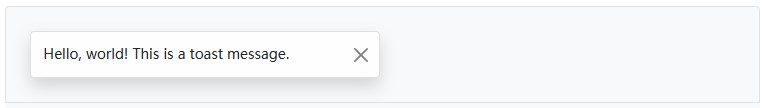
<div class="toast align-items-center" role="alert" aria-live="assertive" aria-atomic="true">
<div class="d-flex">
<div class="toast-body">
Hello, world! This is a toast message.
</div>
<button type="button" class="btn-close me-2 m-auto" data-bs-dismiss="toast" aria-label="Close"></button>
</div>
</div>
另外,也可以在吐司添加额外的控件与元件。
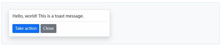
<div class="toast" role="alert" aria-live="assertive" aria-atomic="true">
<div class="toast-body">
Hello, world! This is a toast message.
<div class="mt-2 pt-2 border-top">
<button type="button" class="btn btn-primary btn-sm">Take action</button>
<button type="button" class="btn btn-secondary btn-sm" data-bs-dismiss="toast">Close</button>
</div>
</div>
</div>
七、配色方案
基于以上的示例,也可以透过我们的颜色通用类别建立不同的吐司配色方案。以下我们将.bg-primary与.text-white添加到.toast,再把.text-white添加到关闭按钮上。为了让边缘清晰显示,我们透过.border-0移除了预设的边框。

<div class="toast align-items-center text-white bg-primary border-0" role="alert" aria-live="assertive" aria-atomic="true">
<div class="d-flex">
<div class="toast-body">
Hello, world! This is a toast message.
</div>
<button type="button" class="btn-close btn-close-white me-2 m-auto" data-bs-dismiss="toast" aria-label="Close"></button>
</div>
</div>
八、定位
根据需求,使用自定义的CSS指定吐司位置。右上角通常用于通知,顶部的中间也是如此。如果一次只要展示一个吐司,请将定位样式放在.toast上。

<form>
<div class="mb-3">
<label for="selectToastPlacement">Toast placement</label>
<select class="form-select mt-2" id="selectToastPlacement">
<option value="" selected>Select a position...</option>
<option value="top-0 start-0">Top left</option>
<option value="top-0 start-50 translate-middle-x">Top center</option>
<option value="top-0 end-0">Top right</option>
<option value="top-50 start-0 translate-middle-y">Middle left</option>
<option value="top-50 start-50 translate-middle">Middle center</option>
<option value="top-50 end-0 translate-middle-y">Middle right</option>
<option value="bottom-0 start-0">Bottom left</option>
<option value="bottom-0 start-50 translate-middle-x">Bottom center</option>
<option value="bottom-0 end-0">Bottom right</option>
</select>
</div>
</form>
<div aria-live="polite" aria-atomic="true" class="bg-dark position-relative bd-example-toasts">
<div class="toast-container position-absolute p-3" id="toastPlacement">
<div class="toast">
<div class="toast-header">
<img src="..." class="rounded me-2" alt="...">
<strong class="me-auto">Bootstrap</strong>
<small>11 mins ago</small>
</div>
<div class="toast-body">
Hello, world! This is a toast message.
</div>
</div>
</div>
</div>
对于会推播更多通知的系统,请考虑使用包装元素的方式,让它们可以堆叠显示。

<div aria-live="polite" aria-atomic="true" class="position-relative">
<!-- Position it: -->
<!-- - `.toast-container` for spacing between toasts -->
<!-- - `.position-absolute`, `top-0` & `end-0` to position the toasts in the upper right corner -->
<!-- - `.p-3` to prevent the toasts from sticking to the edge of the container -->
<div class="toast-container position-absolute top-0 end-0 p-3">
<!-- Then put toasts within -->
<div class="toast" role="alert" aria-live="assertive" aria-atomic="true">
<div class="toast-header">
<img src="..." class="rounded me-2" alt="...">
<strong class="me-auto">Bootstrap</strong>
<small class="text-muted">just now</small>
<button type="button" class="btn-close" data-bs-dismiss="toast" aria-label="Close"></button>
</div>
<div class="toast-body">
See? Just like this.
</div>
</div>
<div class="toast" role="alert" aria-live="assertive" aria-atomic="true">
<div class="toast-header">
<img src="..." class="rounded me-2" alt="...">
<strong class="me-auto">Bootstrap</strong>
<small class="text-muted">2 seconds ago</small>
<button type="button" class="btn-close" data-bs-dismiss="toast" aria-label="Close"></button>
</div>
<div class="toast-body">
Heads up, toasts will stack automatically
</div>
</div>
</div>
</div>
还可以使用flexbox通用类别来对吐司做水平和/或垂直的对齐。
<!-- Flexbox container for aligning the toasts -->
<div aria-live="polite" aria-atomic="true" class="d-flex justify-content-center align-items-center w-100">
<!-- Then put toasts within -->
<div class="toast" role="alert" aria-live="assertive" aria-atomic="true">
<div class="toast-header">
<img src="..." class="rounded me-2" alt="...">
<strong class="me-auto">Bootstrap</strong>
<small>11 mins ago</small>
<button type="button" class="btn-close" data-bs-dismiss="toast" aria-label="Close"></button>
</div>
<div class="toast-body">
Hello, world! This is a toast message.
</div>
</div>
</div>
九、可达性
吐司元件对于访问者或用户来说是一个小小的干扰,所以为了帮助那些使用屏幕阅读器和类似辅助技术的人,你应该将吐司元件包装在aria-live region中。屏幕阅读器会自动读出live region中的改变(例如:插入/更新吐司元件),而不需要转移用户的焦点或以其他方式中断用户。
另外,加入aria-atomic=“true”以确保整个吐司元件都会被读取为单一个(atomic)单位,而不只是读出改变的部分(如果你只更新部分吐司的内容,或者在稍后的时间点显示相同的吐司内容,将可能会导致问题)。如果所要显示的信息对于该处理程序是很重要的,例如:表单中的错误列表,请使用警报(Alerts)元件而不是吐司。
注意:在生成或更新吐司之前,必须在标记中包含活动区域(live region)。如果同时动态生成两者并将它们插入页面,则辅助技术通常不会读出它们。
你还需要根据内容调整role和aria-live的等级。如果它是一个重要的信息,例如:错误讯息,请使用role=“alert”aria-live=“assertive”,否则请使用role=“status”aria-live=“polite”属性。
当显示的内容有改变时,请务必更新delay timeout以确保使用者有足够的时间阅读吐司。
<div class="toast" role="alert" aria-live="polite" aria-atomic="true" data-bs-delay="10000">
<div role="alert" aria-live="assertive" aria-atomic="true">...</div>
</div>
当使用autohide: false时,必须增加一个关闭的按钮,让用户可以关闭吐司。

<div role="alert" aria-live="assertive" aria-atomic="true" class="toast" data-bs-autohide="false">
<div class="toast-header">
<img src="..." class="rounded me-2" alt="...">
<strong class="me-auto">Bootstrap</strong>
<small>11 mins ago</small>
<button type="button" class="btn-close" data-bs-dismiss="toast" aria-label="Close"></button>
</div>
<div class="toast-body">
Hello, world! This is a toast message.
</div>
</div>
十、用法
透过JavaScript启用吐司:
var toastElList = [].slice.call(document.querySelectorAll('.toast'))
var toastList = toastElList.map(function (toastEl) {
return new bootstrap.Toast(toastEl, option)
})
1、选项
选项可以透过数据属性或是JavaScript传递。对于数据属性,将选项名称附加到data-bs-,如:data-bs-animation=“”。
| Name | Type | Default | Description |
| animation | boolean | TRUE | 在吐司应用CSS fade转换效果 |
| autohide | boolean | TRUE | 自动将吐司隐藏 |
| delay | number | 5000 | D延迟隐藏吐司(ms)延迟隐藏吐司(ms) |
2、方法
显示:
展示一个元素的吐司。在吐司实际被展示前回传给调用者(即在shown.bs.toast事件发生前)。你必须手动调用此方法,否则吐司不会被展示。
toast.show()
隐藏:
隐藏吐司的元素。**在吐司元素实际隐藏之前(即在hidden.bs.toast事件发生之前)回传给调用者。如果让autohide等于false,你必须手动调用这个方法。
toast.hide()
注销:
移除,隐藏一个元素的吐司。吐司元件将保留在DOM上,但不会再显示。
toast.dispose()
十一、事件
| Event type | Description |
| show.bs.toast | 当调用show方法时,此事件会立即触发。 |
| shown.bs.toast | 当使用者可看见吐司元素时,会触发此事件。 |
| hide.bs.toast | 当调用hide方法时,此事件会立即触发。 |
| hidden.bs.toast | 对使用者隐藏了一个吐司元素时,会触发此事件. |
var myToastEl = document.getElementById('myToast')
myToastEl.addEventListener('hidden.bs.toast', function () {
// do something...
})