Bootstrap巨幕是一个轻量级、灵活的组件,用于展示关键的营销信息。它提供了一种简单的方式来创建响应式布局,可以在不同设备上自动调整大小和样式。要使用Bootstrap巨幕组件,首先需要在HTML文件中引入Bootstrap的CSS和JavaScript文件。
一、示例
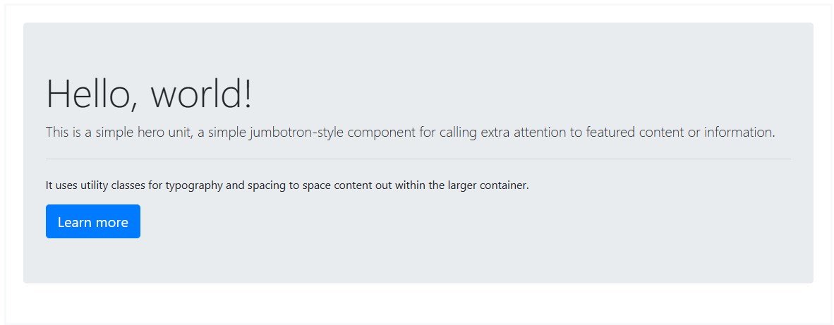
<div class="jumbotron">
<h1 class="display-4">Hello, world!</h1>
<p class="lead">This is a simple hero unit, a simple jumbotron-style component for calling extra attention to featured content or information.</p>
<hr class="my-4">
<p>It uses utility classes for typography and spacing to space content out within the larger container.</p>
<a class="btn btn-primary btn-lg" href="#" rel="external nofollow"  role="button">Learn more</a>
</div>
二、无圆角示例
要使巨幕变宽且不带圆角,请添加修饰符类并添加 or within。
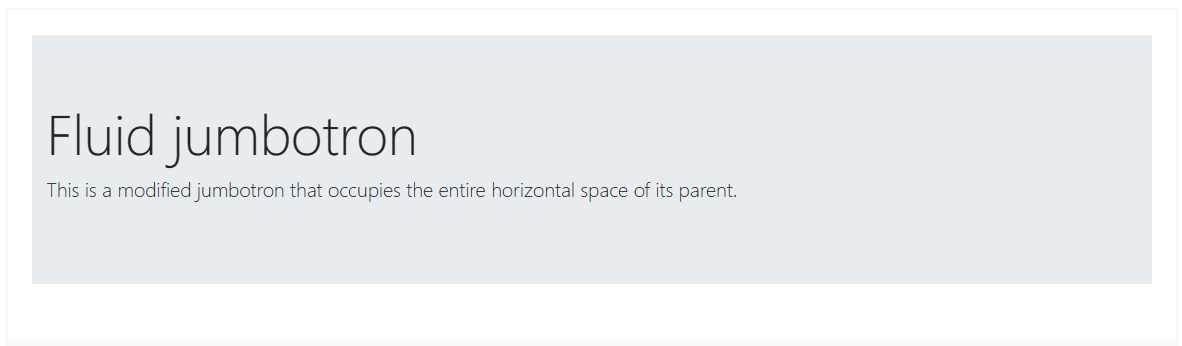
<div class="jumbotron jumbotron-fluid">
<div class="container">
<h1 class="display-4">Fluid jumbotron</h1>
<p class="lead">This is a modified jumbotron that occupies the entire horizontal space of its parent.</p>
</div>
</div>